A shallow dive into CDC excess deaths data

I’ve been seeing online analyses of US Centers for Disease Control (CDC) mortality data, trying to find signals of health problems relating to vaccines, and decided to take a look for myself. The data can be found here: CDC Dashboard. I fetched data for the 25-44, 45-64, and 65-74 age groups, by week, from 2015 onward. To avoid the from/with COVID problem, I’m looking only at all deaths. To avoid reporting lags, the present analysis terminates on 1 January 2022. The baseline period is 2015-2019, inclusive, and excess deaths for the 65-74 age group had a significant secular trend removed.

Figure 1 shows expected deaths by week, determined by averaging across the 2015-19 time frame. Deaths notoriously have a seasonal cycle, higher in winter, lower in summer, but that’s for all age groups. This seasonal cycle is very nearly absent from the 25-44 age group. The average number of weekly deaths in the 2015-2019 time frame in this age group was 2627 with a standard deviation of 57. The seasonal cycle appears in the 45+ age cohorts. An interesting and accidental result is the number of deaths in the 45-64 and 65-74 age ranges (means 10348 v. 10136) are comparable over the baseline period (2015-19), though the latter has more variability (standard deviations 402 v. 502) owing to a more pronounced seasonal cycle.

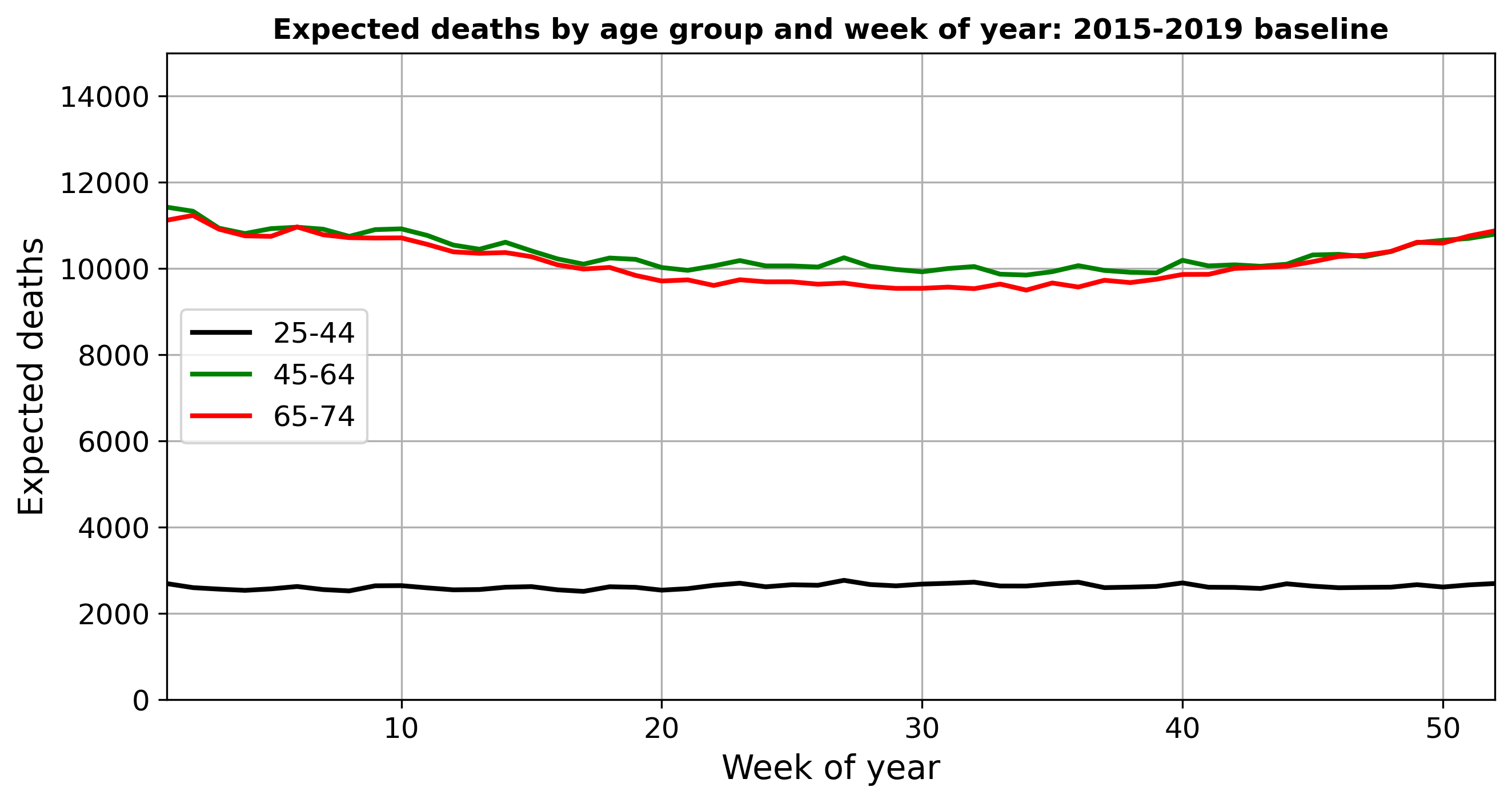
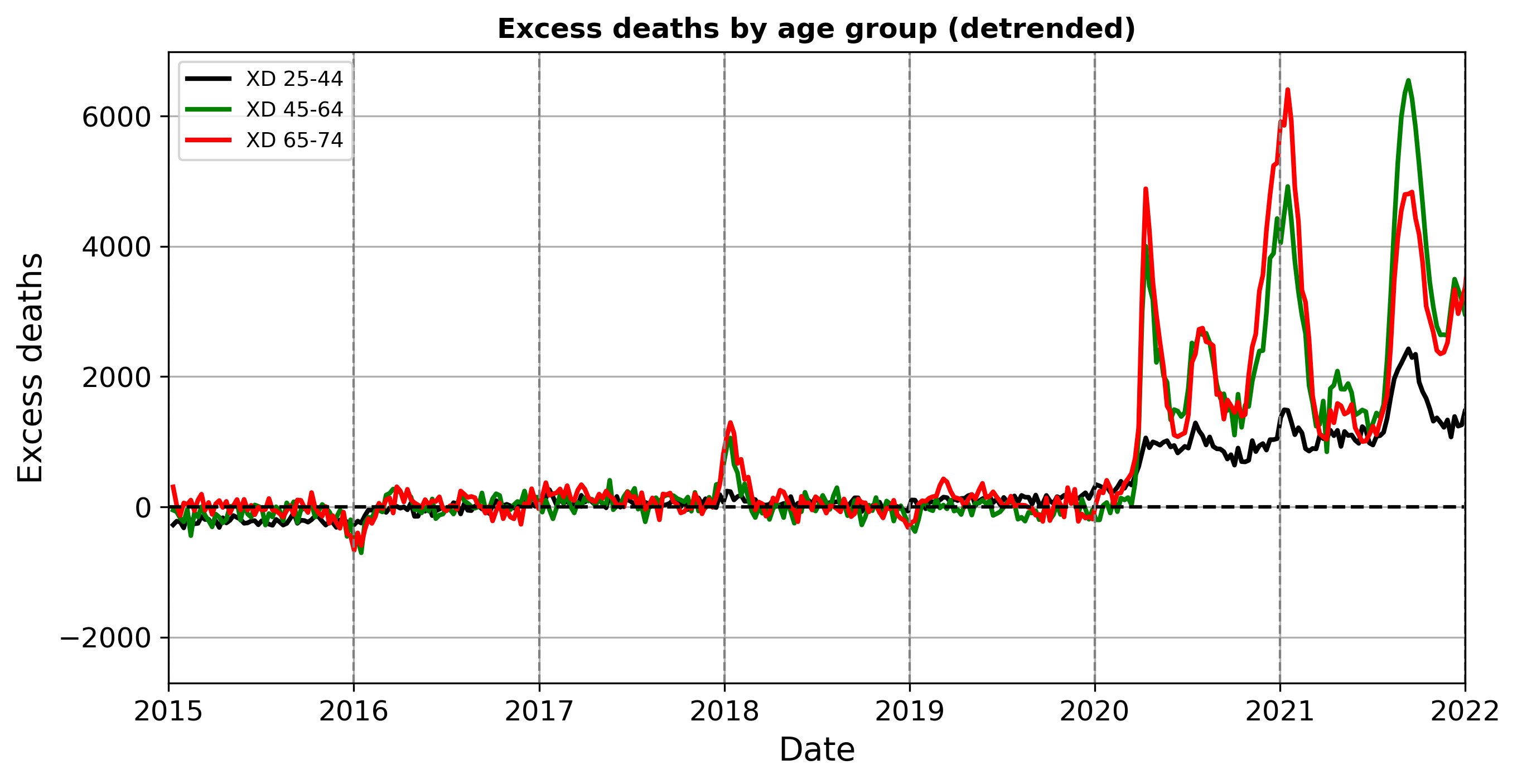
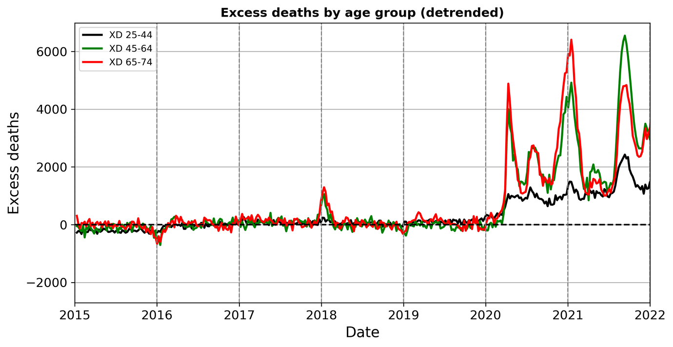
Figure 2 shows excess deaths (XD = total-expected) for the three age groups by week for 2019 through the end of 2021. The 65-74 age group was adjusted for an upward secular trend derived from the 2015-19 time period. That cohort is getting larger and/or sicker; both may be true. In any event, after adjustment 2019 and early 2020 were close to normal for all three age groups.

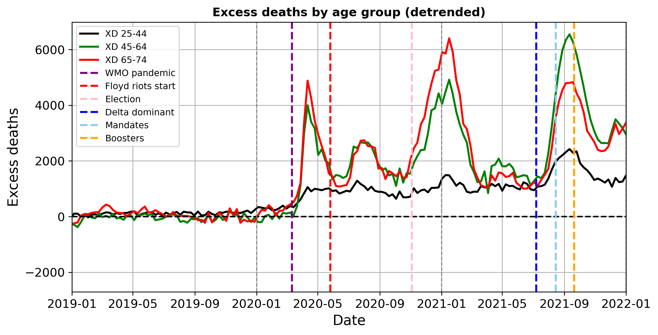
Then COVID hits. WMO declares a pandemic on 11 March 2020 (purple line). XDs in none of the groups return to anywhere near the baseline. The 25-44 cohort experiences a so far permanent step up in April 2020. Some of this increase in all-cause deaths is due to suicide, depression, and alcohol and drug abuse. The particularly elevated numbers of 2021 for this group started in late July and returned to their new normal by late October.

Most striking is that XD 45-64 caught up to and surpassed XD 65-74 by sizable numbers in that same time period. This might reflect the threat and implementation of vaccine mandates (green line). United Airlines issued its vaccine mandate in August 2021 [A] and Biden announced his mandate threats on 9 September [B]. Boosters (orange line) became available on 20 September for healthcare workers and older persons [C].

The next plot presents the weekly difference in excess deaths between the 65-74 and 45-64 year old groups. Based on pre-pandemic variability, I will interpret values in the +/-500 range as near-normal for whatever normal is in that time period. Now the baseline is relative: positive values mean more 65-74 year olds dying compared to those aged 45-64, even though deaths in both groups are elevated during the pandemic, as seen in Fig. 2.

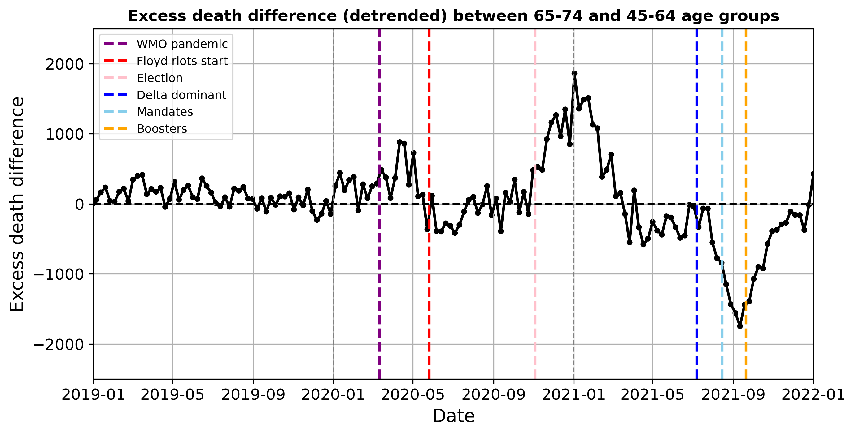
COVID formally emerges in March-April 2020, hitting both cohorts but the older one harder, leading to the positive XD differences. A return towards the relative (not pre-pandemic) baseline followed, during which deaths in the younger group were a bit higher for a period. Some of this may be due to pull-forward deaths in the older cohort. Still, note the Floyd riots, which started on 26 May 2020 (Marxist red line), may have accelerated cases and deaths among younger Biden voters. However, we are reliably informed that, though not alive, the SARS-CoV-2 virus was sufficiently ‘woke’ as to eschew infecting the politically correct in densely packed settings. Thus, this may be coincidence or noise.

There is a return to the relative baseline in summer 2020 (although excess deaths for both groups are far above normal) until Election Day (pink for pinko). The subsequent big spike in relative excess deaths in the 65-74 group peaked in early January 2021. Vaccines only started becoming available a few weeks prior to the peak [C] so that does not explain this. Perhaps part of this could be due to deferred or cancelled medical procedures and cancer screenings that would impact the 65+ age group much harder than the younger group finally becoming significant.

Then, following a return towards the relative baseline, there is just as large of a reverse spike – more 45-64 year old excess deaths than among 65-74 year olds – starting March-May 2021 and peaking 11 September 2021. Perhaps some of the 65-74 deaths that were pulled forward into January 2021 would have occurred in that time window, leaving fewer older people to die. But the surge follows Delta becoming dominant (blue) and the announcement of vaccine mandates (green). Some of this huge swing is likely vaccine injury, extending as it does into the 25-44 age group.

To conclusions yet. In any case, we are a long way from returning to the old normal as far as expected deaths are concerned. If COVID remains relatively dormant, but excess deaths remain high, some explaining has to be done.

[A] United Airlines ends vaccine mandate for staff after firing hundreds of employees
[B] COVID-19 vaccination in the United States - Wikipedia
[C] U.S. to begin offering COVID-19 vaccine booster shots in September | Reuters

8 Likes

Thank you for this, Cyrano. It is a very interesting analysis. You are right to focus on total reported deaths, since all other numbers are dubiously Fauci-ized.

The sudden shift in early 2020 to an extra ~1,000 working age (25-44 years old) deaths per week is really quite surprising – and hard to explain. A steadily increasing trend or a sharp spike would be easier to explain in terms of social/economic pressures on the working-age population.

One thought about the 2015-2019 baseline – perhaps that period might be anomalously “quiet”? It would be interesting to learn the range of departures from the baseline for earlier years. I have looked for that data, but have not found convenient good sources.

4 Likes

Hi Gavin, thanks for your reply. I have not yet found data farther back than 2015, but the plot below might be helpful for placing the past 2 years in a wider historical context.

Compared to the COVID era, 2015-2019 was pretty quiescent, but I don’t sense that it was unprecedented in recent times. From flu statistics visualized on this site, I see that winter 2016 appeared to be a lower than average flu season within the 2015-2021 period while winter 2018 was bad. Winter 2020 was shaping up as a bad flu season as well before COVID appeared and abruptly terminated its typical long tail.

Looking at the flu data back to 1995 (see below) suggests the recent decade has had more flu activity an thus might not have been a particularly quiescent period. However, flu surveillance may have improved with time, meaning that older seasons may have been undercounted.

5 Likes

Thank you @Cyrano for sharing this analysis.

What are the key takeaways. It seems like a few things jump out: vaccines don’t appear to have much effect, except possibly inverting the XD distribution to younger cohorts (are those deaths due to vaccine side effects?)

This graph convincingly argues for a strong seasonal component that explains the 45+ XD variability. Almost as if humidity plays a role in both winter and summer, when at least part of the population stays in very dry air-conditioned indoor spaces.

And lastly, XD trends at the end of 2022 do not indicate any reduction in death impact at the population level supporting the relaxation of protective measures that were in place 2020-21.

So was Malone correct in advancing the “mass psychosis” hypothesis as the explanation behind our frenetic pandemic reaction?

2 Likes

A meandering answer…

I decided to analyze these data and post this here because of two things: (1) people discussing online that September 2021 bulge in the 25-44 year old excess death (XD) plot; and (2) the passing last week of my neighbor, from what I suspect is a vaccine injury. In contrast to Biden, who seems to think everyone knows someone who’s subject to blackmail, I believe many of us know one or more persons who have died unexpectedly in the recent past from reasons other than COVID.

Fetching and plotting the data for myself, I do indeed see the bulge in XD 25-44, around the time that vaccine mandates were threatened if not implemented. That, combined with the simultaneous inversion between 45-64 and 65-74 year old XDs, represents to me some hints that some of the younger deaths may be vaccine-related.

But there is more than that here. I was also struck by the fact that (1) excess deaths have not gone back to anywhere near what used to be normal, as even during lulls between COVID waves XD remains historically very, very high, and (2) that was also true in the 25-44 age group as well. The lack of sizable waves, other than the September 2021 bulge, in the 25-44 group is very curious. And it is trending upward, even without that bulge. The plot below shows just 25-44 year old total (not excess) deaths, without adjustment, helping demonstrate that.

Even as COVID ostensibly recedes (I’m sure it will be back in time for the midterm elections), deaths are still running very high. My tentative takeaways might be: this started with COVID but isn’t just COVID, vaccines didn’t really help and likely did more harm than good, and we’re nowhere near our pre-pandemic normal. And we need to know why.

4 Likes

User “Ethical Skeptic” on Twitter has been posting CDC National Center for Health Statistics charts for a variety of cause of death codings and demographics covering the period from the onset of COVID through the present. Many of these, including those not usually associated with COVID, show persistent elevated levels after deaths attributed to COVID have fallen off. For example, here is all non-COVID deaths in the 25–54 age range.

This is lymphatic system related deaths.

Non-Hodgkin lymphoma:

Renal failure:

Unfortunately, these charts have not been collected together on a Web page where you can view and compare them easily. You have to look at the Twitter feed and scan for the dark grey charts among a variety of other unrelated posts. Still, it appears that something is going on which doesn’t fit the obvious explanations.

Finally, we have this really odd one.

https://twitter.com/EthicalSkeptic/status/1502844737551753220

6 Likes

Thanks, John. Among other sources, I’ve been following the Ethical Skeptic’s tweets. I recall that last fall he made a hypothetical connection between COVID spread in the Corn Belt with the application of sludge (recycled human waste) on the fields. An interesting observation I haven’t seen followed up on.

I wish he’d change his approach to chart making, though. I think Edward Tufte would also disapprove of his style. Cluttered, dark, hard to read.

Other sources you may have seen: Jessica Rose digging through cause of death data for younger Americans. This guy may have gotten the boulder rolling downhill. Lots to dig into here, but we’re all using the same source. Data from that comprehensive human experiment that is Israel might be very valuable, but they don’t make it easy to get.

7 Likes

I wonder if the reference you mention is not this post? He/she? argues COVID-19 was present in China as early as March 2018, at epidemic levels. Her/his? arguments consist of the following.

  1. The mismatch in timing of Chinese SARS-CoV-2 B.1 and B.1.617.2 variant global rates of spread
  2. The conclusive evidence of both risk and culpability that SARS-CoV-2 was released (not zoonotic) from a Chinese BSL gain-of-function lab (during a U.S. ‘pause’ in such research)
  3. The elevated rates of unidentified ‘flu’ in longitude E65-180 nations during 2018/19, matching geographic pathogenic history
  4. The observed natural progression of a 47 to 1 Covid prior immunity signal, in longitude E65-180 and across 173 nations (which presided up until Delta variant natural-immunity breakthrough infections)
  5. The genetics and mutation history of SARS-CoV-2 itself, which strongly suggest an inception case date in early 2018 – from a mouse environment, not wild animal
  6. The 2021 appearance of a pre-October-2019 genetic Jan-2018-LCA highly divergent variant of SARS-CoV-2 (Omicron) in highly immune African populations under low mutagenic pressure
  7. The CCP’s social response to an unknown, which resulted in 45-year unprecedented CO2 ppm reductions during 2018/19
  8. The CCP’s reactive social disruption patterns exhibited during 2019
  9. The CCP’s Nelsonian knowledge of SARS-CoV-2 exhibited in December 2019, along with its concerted efforts to conceal critical information, databases, 8 index-genomes, 174 index and inception case patient samples/profiles, and pertinent lab production logs.

I was intrigued by #3, #4, and #7 and the notion of “Nelsonian knowledge”. Definitely an interesting post, but plan for a long read, since it comes in at over 15,700 words.

3 Likes

Yes, thank you, that post’s Exhibit 1.2 is what I had in mind. I found the tweet that I had seen it in: https://twitter.com/EthicalSkeptic/status/1388588364035657728

He places great emphasis on the role of surface-based CAPE (Convective Available Potential Energy) – in practice, thunderstorm updrafts – to spread aerosol particles < 5 microns around but I don’t think he has to go that far. Owing to drag, particles that small have no appreciable fall speed relative to still air, and I suspect it is quite easy for them to get mixed upward due to daytime boundary-layer (near surface) turbulence and into the free atmosphere farther above, where they can spread far and wide.

One question is how long do the viral particles remain intact enough to be infectious. Early on in the pandemic, there were claims that virus particles remained viable for hours or days on surfaces like countertops (remember spraying everything?) but I thought many of those claims were later not found to be true.

4 Likes

And how long would viral particles survive UV radiation exposure? The FDA quotes a Nature article showing that UVC radiation “efficiently and safely inactivates airborne human coronaviruses”

A 2020 paper discusses the effect of “simulated sunlight” on COVID-19 particles and states that "Ninety percent of infectious virus was inactivated every 6.8 minutes in simulated saliva and every 14.3 minutes in culture media when exposed to simulated sunlight representative of the summer solstice at 40°N latitude at sea level on a clear day. Significant inactivation also occurred, albeit at a slower rate, under lower simulated sunlight levels. "

So I am not clear on how updrafts and sunlight might interact to allow spreading COVID-19 particles over large geographical areas. A bit of folk wisdom surfacing in the last two years is that the virus appears to be nocturnal, hence the curfews instituted in many jurisdictions… So perhaps CAPE propagates the virus particles at night?..

1 Like

The solution to pollution is dilution. I can’t see viruses spreading in air currents.

3 Likes

As it happens, “Ethical Skeptic” revisited this topic yesterday, or earlier today. He cites a paper that claims that “…the solid particles in the sludge and biosolids serve as a protecting shield against the degradation of SARS-CoV-2 RNA.” I have no idea whether this is true or not. For his basic argument – that is, a COVID outbreak in an area followed the spread of biosolids – it seems to me that he doesn’t really need a dispersal or transport mechanism. Just a way of putting viable virus in the way of humans, as humans will then do the rest.

https://twitter.com/EthicalSkeptic/status/1506996856605315080

3 Likes

We have also learned that the virus does not affect Biden voters while in the act of Burning, Looting, and Marauding (i.e., BLM). Actually, I think that’s true, a sort of professional courtesy between virus and villain.

5 Likes

This #Discourse instance definitely needs laugh buttons…

2 Likes

From the abstract of the Science Direct paper in ES’ tweet, emphasis mine:

The novel coronavirus, SARS-CoV-2, which has caused millions of death globally is recognized to be unstable and recalcitrant in the environment, especially in the way it has been evolving to form new and highly transmissible variants.

I admit I stopped reading after that first sentence. Virus personification calls into question the choice of publication imo…

3 Likes

“Don’t anthropomorphize nature, she hates that.” I wonder who said that first.

My university has changed its mask policy. Masks only have to be worn in classes, but not otherwise. So, say I have a class in Room 101. Everyone has to wear a mask. Then, class ends and the very same group remains for a meeting. The masks can come off.

I have to tip my hat to the SARS-CoV-2 virus. It won’t infect arsonists but it can tell if you are in danger of learning something. Don’t argue. It’s ScIeNcE, you denier you.

5 Likes

Nothing to see here. Move along.

Here is information on the freedom of information request and the reply by the hospital [PDF].

7 Likes

Life expectancy trends are arguably a more objective measure of excess mortality. Excess mortality depends on the interpretation of what’s normal. For example, the post 2020 bump in mortality after the new years socializing is now ‘expected’, and no longer ‘excess’. Here’s the life expectancy trend for the US:

In spite of the snide markup, excess mortality is present across the world:

German deaths 2016-2023 by day/week/year/age/gender are published every few weeks in a long PDF.

March 2023 has been the most deadly March of the pandemic for example, once the masks were dropped in medical settings on March 1st.
This year‘s winter dead (Dec/Jan/Feb) were around 50k higher than pre-pandemic, almost the same as during the Delta wave, that crushed the German cremation system in places.
The more interesting part will be whether we see a larger summer spike in all cause deaths compared to last year, which already had a very unusual summer spike in the middle of a massive summer COVID wave.

That looks like the DC Swamp has had a great success in freeing up more cash to send to Zelensky’s money laundry. Think of the savings from offing us peons at 76 versus the 83 years those backwards Euros live! That could average about $300K per sadly deceased in Social Security alone, plus the significant additional savings from avoiding 7 long years of Medicare.

Undoubtedly the G7 ruling cliques will be looking at this data with admiration, and sending envoys to DC to get clues on how to “improve” their own performance.

5 Likes