Ben, the purveyor of USMortality, posted some interesting data and plots on Twitter (@USMortality) recently. The plot of 2021-22 flu season all-cause mortality (ACM) per 100K population (y-axis) v. percent fully vaccinated (x-axis) by state (lower left in figure below) strongly suggests the injected are significantly better protected. (Please note that “flu season” basically means the cold half of the year, nominally consisting of weeks 40-52 of one year combined with weeks 1-13 from the next. These are ACM data, and not flu cases or confined to flu deaths.)

However, a very similar relationship was found for the 2020-21 flu season, which was largely before the vaccine rollout (upper left). Clearly, there is at least one confounding variable. He then plotted the change in mortality between 2021-22 and 2020-21 (y-axis) v. fully vaccinated percentage (x-axis) (plot at right above) and found a small positive correlation, weakly suggesting that more vaxxed states actually had worse outcomes in the vaccine year 2021-22. In other words, there’s no evidence the vaccines have been protective.
Source: Twitter
The Ethical Skeptic on Twitter has been doing some analyses like this [1], as has Mathew Crawford on Substack [2], but I’m going to use Ben’s data as a starting point for my expanded analysis, which seeks to compare COVID years to the pre-pandemic 2015-19 period. There are some glitches in Ben’s analysis, which I identify and resolve below, but his main conclusion is unchanged: there is no demonstrable benefit from vaccination detectable in the all-cause mortality data, at least that I have been able to find.
The two most important glitches are:
-
His fully vaccinated cohort was erroneously labeled “18 years old and up”, but was actually confined to 18-64 year olds only. However, acknowledging this makes his point stronger. The 2020-21 flu season included 2021 weeks 1-13, and the vaccine was rolled out primarily to persons older than 65 during that period. Restricting the vaccination population to those under 65 helps make the two COVID years more independent with respect to injection.
-
He appears to have double-counted deaths derived from the US CDC website, which reports “predicted” and “unweighted” deaths for each age group, week, and jurisdiction. That is why my numbers are about half of his.
I started largely from scratch and constructed a database that consists of
- 2020 census population by state (ages 0-64);
- 2015-19 flu season ACM by state: weeks 1-13 and 40-52, for 25-64 year olds (130 weeks total), then averaged by year;
- 2020 flu season ACM by state: 2020 weeks 41-53, 2021 weeks 1-13, for same groups (26 weeks);
- 2021 flu season ACM by state: 2021 weeks 40-52, 2022 weeks 1-13, for same groups (26 weeks);
- fully vaxxed percentage as of week 40 of 2021, from Ben.
Note I have ACM for ages 25-64, vaxxed for 18-64, and census data for 0-64 years old, not exactly congruent, but not too bad either. I’m avoiding 65+ to keep the 2020-21 season as vaxx-free as possible.
Next, I removed jurisdictions that had any missing records for either 2015-19, 2020-21, or 2021-22 flu seasons. This excised 16 jurisdictions (AK, DE, DC, HI, ID, IA, KS, ME, MT, NE, NH, ND, RI, SD, VA, WY), leaving 35 states. The NY data is very likely only for the upstate region, excluding New York City. It should be borne in mind that some of the 2022 data may yet be incomplete.
In the figure below, (a) shows 2021-22 season ACM for each state plotted against the percent of 18-64 year olds who were fully vaccinated as of Week 40 of 2021. Efficacy! Give Pfizer and Moderna another half a trillion dollars. The squared correlation is R2=0.55, equivalent to a simple linear correlation of r=-0.74. Low mortality rates for those science-believing Blue States like CT, MA, and VT. Meanwhile, they’re dropping like flies in recalcitrant, science-denying Red States like AL, MS, and AR. UT and WV seem like outliers, perhaps consistent with age (UT has the lowest median age, WV the highest of the retained states). Something’s rotten in NM and keep in mind NY is lacking NYC.
My R2 (0.55) is higher than Ben’s (0.44) possibly because incomplete records can skew the relationship, increasing the scatter. Some of the states I had to remove were among the worst outliers in his plots.
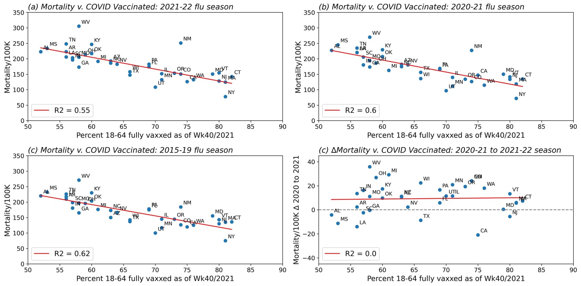
But, consistent with Ben’s analysis, (b) shows an even higher correlation (R2=0.60, r=-0.78) between 2020-21 season ACM and percent fully vaxxed from a vaccine that had not been rolled out yet. (The great thing about the religion of science is that pesky arrow of time becomes malleable.) Actually, graphs (a) and (b) bear quite a strong resemblance, not only to themselves, but also with (c), which shows past ACM from 2015-19 vs. vaxxed percentage from late 2021 (R2=0.62, r=0.79).
Plot (c) helps prevent misinterpretation because there’s no COVID contamination in those data at all. It is clear that ACM is higher in some states than others. Wealth, health, education, and demographics all have roles to play, among other factors, but that confounder has to be removed to truly assess whether the vaccines are doing any good.
Finally, (d) shows the change of ACM from the 2020-21 to 2021-22 seasons, plotted against percent fully vaxxed, similar to what Ben looked at. Again bearing in mind some of the 2021-22 season data may be incomplete, most states in the analysis had higher ACM in 2021-22 than in 2020-21 (so it might actually be worse). Only 8 of 35 states had higher mortality in the first COVID year, including CA, LA, MS, TX, NJ, AL, SC, and GA. Largest ACM increases year on year were in WV, MI, OH, and NM. But, overall, there’s no correlation with percentage of fully vaxxed. Zero. If the vaccine were efficacious, would we not see some kind of signal in these statistics?
[1] https://twitter.com/EthicalSkeptic/status/1532420000543383559
[2] https://roundingtheearth.substack.com/p/a-mechanistic-explanation-of-the?s=r