As the year 2020 unfolded, I had a long-running feature on the now-closed Ratburger site called “Year of the Jackpot”, named after the eponymous Robert A. Heinlein story (read it online [PDF]). In it, I would post the many charts in which all of fluctuations in recorded history were reduced to small wiggles around the X axis followed by a huge vertical spike in mid-2020. Many of these charts have now begun to revert to their pre-2020 values although some, such as public debt, have leveled off with the 2020 bulge as the “new normal” or taken off from there.
Google Trends allows one to chart the frequency of words or phrases in searches performed by the Google search engine. It provides a sense of what is on the public mind over the years the engine has been in existence. Data are available from 2008 to the present.
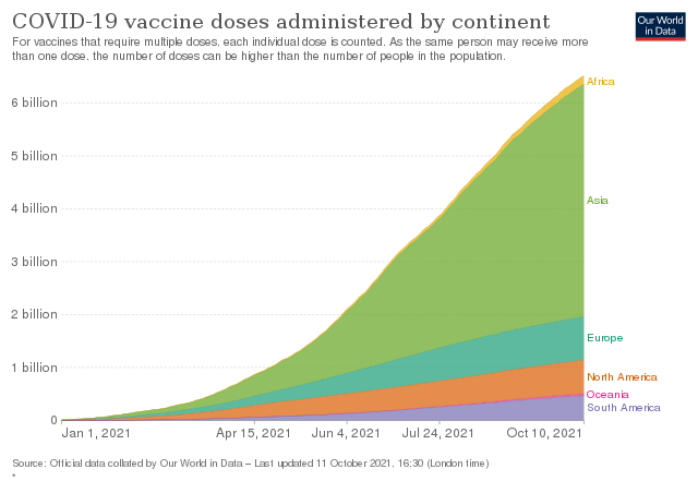
Before we look at some Google Trends charts, let’s first look at this chart which shows the worldwide uptake of COVID-19 vaccines by region from the start of 2021 through the present. As you can see, it was around May 2021 that vaccination started to become widespread.
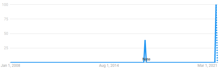
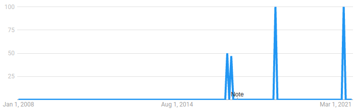
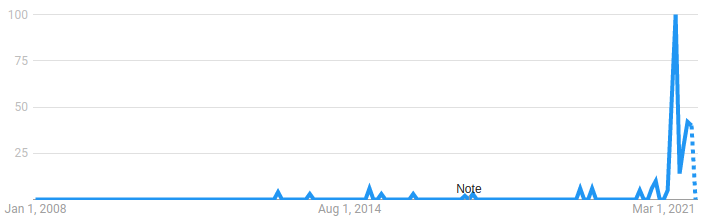
Now let’s try some Google Trends queries. Clicking the search term will display a live Google Trends query for that item, allowing you to modify the search parameters. All of these queries were made with settings:
- Worldwide
- 2008 – present
- All categories
- News search
died after a short illness
unexpected death
myocarditis
Nothing to see here; move along.