There are few better illustrations of the fundamental corruption of government than the inevitable destruction which inevitably results when it arrogates to itself the sole ability to define what “money” is and create it whenever it wishes. The consequences of government monopoly money provide an excellent window into the lies and deception which accompany government monopoly on anything, and nothing exemplifies this better than the concept of “inflation”.
Inflation, properly defined, is when the supply of money in circulation increases. This can occur for many reasons. When Spanish conquistadors looted South America of its gold and silver starting in the 16th century, all of this precious metal found its way back to Spain and ended up in circulation, resulting in the Price Revolution which caused the price of goods in Europe to rise, in terms of gold and silver coins, by a factor of six over a period of 150 years. This is easy to understand: it’s just a matter of supply and demand. If you increase the supply of whatever is used for money, then the amount of goods and services that money will buy will decrease by the corresponding amount. A similar inflation followed the discovery of gold in California in 1848, as the subsequent gold rush caused the amount of gold in circulation to rise rapidly and thus its purchasing power to decline.
But if you want inflation on a Biblical scale, nothing beats paper money, where a government, as its monopoly issuer, can just print as much as it wishes to cover the spending of profligate politicians or, in our modern digital age, not ever bother to print it but just create it through pure zap, making up digital “dollars” and dumping them into the banking system with a keystroke or mouse click.
History records a near-endless litany of great inflations followed by economic collapses over a period of more than forty centuries and all around the globe, but at the heart of every one is a government creating funny money and dumping it into an economy in the hope of deceiving the population into accepting it at its original value. As that sage economic philosopher Rocket J. Squirrel said, “Awwww…that trick never works!” But that doesn’t keep them from trying.
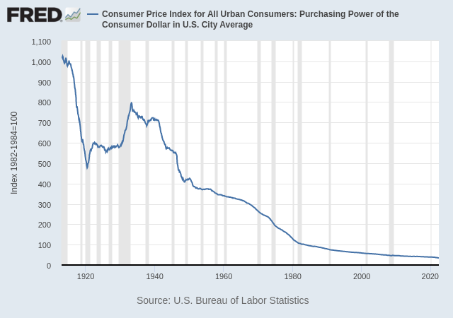
In 1913, the U.S. government turned over creation of its money to an “independent central bank”, the Federal Reserve System, with congressionally-mandated goals of “maximizing employment, stabilizing prices, and moderating long-term interest rates”. How well have they done? Well, let’s look at prices, which are just another way to talk about the value of the dollar. Here is the purchasing power of the U.S. dollar from 1913 through May 2022.
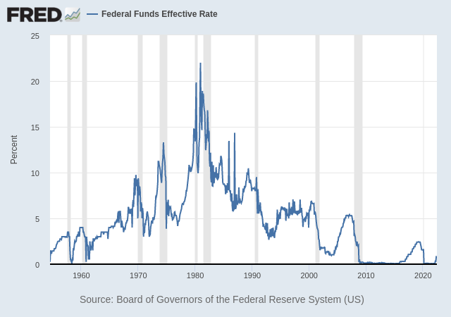
How about that business of “moderating long-term interest rates”? Here, we only have data from 1954 through the present, but let’s see how they’ve done over that period, looking at the Federal Reserve’s own interest rate benchmark, “Federal Funds”.
Moderate, huh? The percentage change over a range of 0 to 22 percent is…infinite.
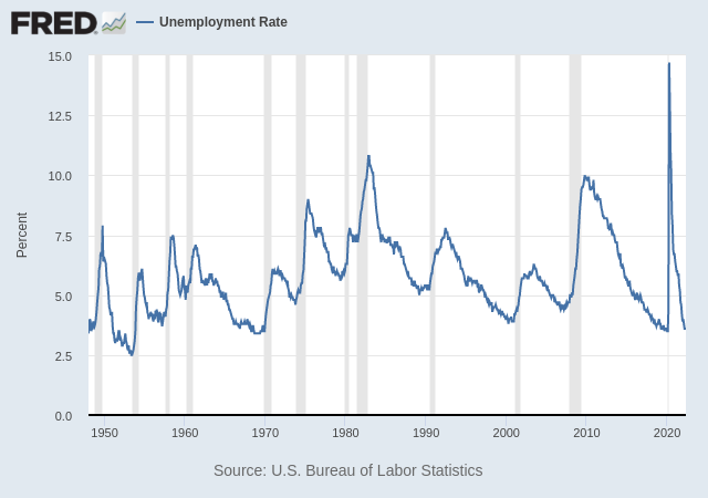
OK, so their performance on price stability and interest rate moderation wasn’t exactly stellar (unless you consider collapse into a black hole or a supernova explosion as stellar behaviour), but maybe all of this fiddling with the money was toward the end of “maximizing employment”. How did that work out? Here is a chart of the unemployment rate from 1948 to the present.
Heck of a job!
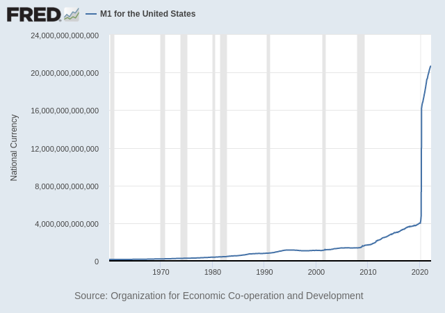
The Federal Reserve attempts to achieve its goals by adding or removing (HAH!) money from circulation. When it adds money, that is, by definition, inflation, and it reduces the purchasing power of each dollar in circulation, with the effects seen in first graph in this article. Let’s take a gander at “M1”, a measure of the amount of liquid money in circulation, from 1960 to the present.
Notice anything odd? Looks like there’s a lot of new money sloshing around in the system, doesn’t it.
But that’s inflation, and we should expect the purchasing power of the unit of money to fall or, on the flip side, prices in general to rise. Is it any surprise that’s precisely what we’re seeing?
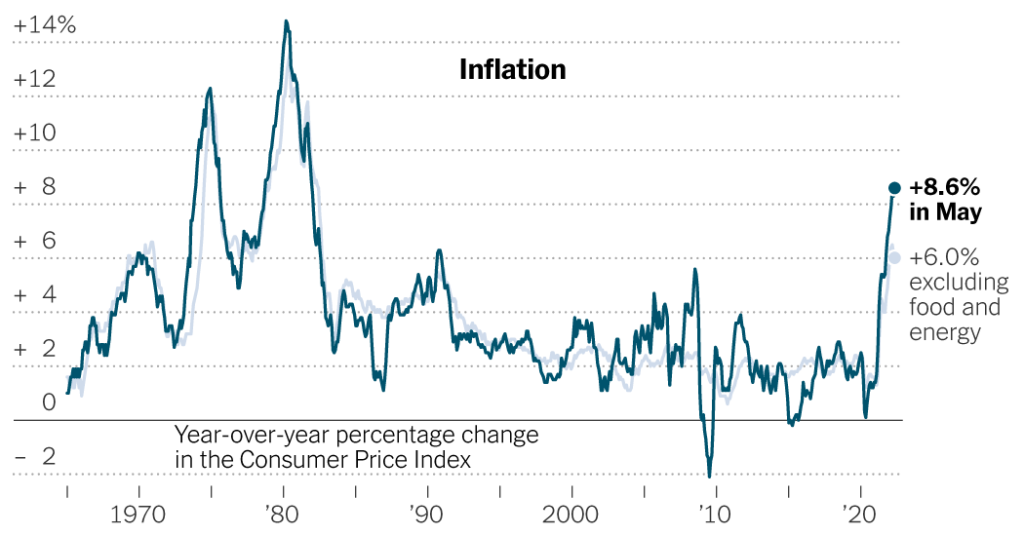
Now we come to the first big fraud in the game. Governments, their trained seal mouthpieces in the legacy media, and the midwit population who listens to and believes them, call this rise in prices “inflation”. In other words, they apply the name of the cause—increase in the money supply—to the effect—rising prices, because this allows them to escape blame, pinning it instead on “supply chain problems”, “greedy corporations”, “price gougers”, “gnomes of Zürich”, wars, foreign dictators, or, heaven knows, “climate change”—anything but the real culprit: printing money out of thin air. Thus, you will see charts in the media like the following, updated through May 2022.
That bold “Inflation" title is the bold-faced lie. Prices are rising because of inflation: they are not inflation. How and when prices rise as a consequence of an increase in the money supply is a complicated matter, as new money does not flow instantly or uniformly through an economy, but it is absolutely inevitable that eventually prices will rise in proportion to the increase in money supply.
But the price numbers they’re calling “inflation” are, themselves, compiled and reported by the same band of thieves and murderers who are printing the funny money. Can you trust them? What do you think? The “inflation” numbers most commonly cited for the United States are assorted versions of the “Consumer Price Index” (CPI), of which there are numerous variants and regional measures. Basically, they take a “basket” of goods and services, apply weights and fudge factors, then come up with an aggregate number that is supposed to represent the impact on a typical consumer of the overall increase in prices. Does it? The devil is in the details, and when it’s the devil incarnate on Earth that’s picking the fudge factors, what do you expect?
The last time the inflation racket became widely apparent in the U.S. was during the inflationary era from the mid-1960s through the early 1980s. During that time, the populace began to wise up to how they were being pushed into ever higher tax brackets due to “wage and salary increases” which failed to even keep up with rising prices, how their savings and investments had a negative return in terms of purchasing power and were, as a double whammy, taxed as if the dollars they returned were worth as much as those paid for them, and how retirees and others on fixed incomes were being reduced to pauperism as the pension payments they had been promised fell in value every month as the dollars in which they were denominated evaporated in value.
Once it became apparent what was going on, and the media even began to report money supply figures as they were released, the natives began to become restless and politicians, always seeking to cover their tracks before things get to the torches and pitchforks stage, rolled out “indexing” (or the even more clumsily named “indexation”) as the “solution” to the problems they had created. If, for some mysterious reason, the dollar was falling in purchasing power, they would automatically adjust tax brackets, pension payments, and interest rates on some government debt to automatically compensate and maintain these at fixed levels in terms of purchasing power, usually defined in terms of some flavour of the CPI.
But, like most government solutions, this created more problems. For many years, government had been using inflation to pick the pockets of the populace without too many wising up to what was going on. Once they let it get out of control and it became obvious, they were forced to introduce indexing based upon the CPI. But this threatened putting an end to the gravy train—more and more money flowing into the trough by pushing taxpayers into higher brackets, increased sales and property tax income for states and localities, taxes on “capital gains” that were mostly or entirely due to currency depreciation, and slow but inexorable liquidation of debt and pension obligations as fixed income payments eroded and pensioners sampled the variety of canned cat food available at the supermarket.
Since all of these indexing adjustments were based upon the CPI which, after all, was calculated by a U.S. government agency, the Bureau of Labor Statistics (BLS), it was not long until the Aha! moment arrived. “The CPI is whatever we say it is!” And so it was, starting primarily in 1980, when the great 1970s inflation was just topping out, that the Department of Jiggery-Pokery—sorry, BLS—began a series of “revisions” and “adjustments” to how the CPI is calculated, changing the mix and weighting of items in the basket, and applying “hedonic index” corrections to compensate for supposed increase in the value of products independent of their price, for example the performance of personal computers at a given price point.
Care to guess in which direction all of these CPI adjustments went?
Right in one: they all reduced the CPI compared to the way it was computed previously, with two major revisions in 1980 and 1990. So when you read that “inflation” as measured by the CPI was 8.6% annualised for May 2022, that means the number reported was that calculated by the 2022 method, with all of the changes and tweaks over time.
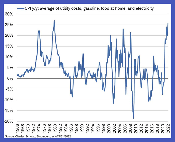
Now, if you, as most people, live in the real world and buy groceries, fill up your car’s gas tank or home heating oil cistern, pay your electricity bill, and other regular expenses, you may have noticed quite a gap between these reported “inflation” numbers and how much more you’re paying for everything. Then, you might ask, whether the CPI can be trusted any more than anything else produced by the government and, in particular, what the number would have been without all the jiggery-pokery cranked into its calculation since 1980.
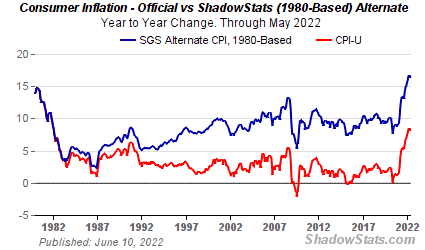
Fortunately, for many years John Williams has been publishing a Web site called ShadowStats.com, which regularly computes and publishes a variety of government economic statistics, including the CPI, money supply, unemployment index, and gross domestic product, using the formulas employed by the government agencies that compile them prior to their redefinition over the years to produce “better results”. Here is the ShahowStats CPI “Inflation” chart through May 2022 computed according to the way the BLS computed it prior to 1980.
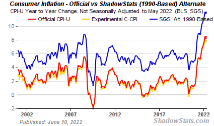
This is the same chart, but starting in 2000 and using the method and parameters used prior to the 1990 revision of the CPI.
So, take your pick. According to the official BLS CPI, “inflation” for May 2022 was at an annual rate of 8.6%. If it were computed using the definition in effect in 1990, it would have been reported as around 12%, and based upon the definition prior to 1980 when the phony figures began to be fudged to cope with funny money, it stands at 16.8%.
Which feels closer to reality to you?
